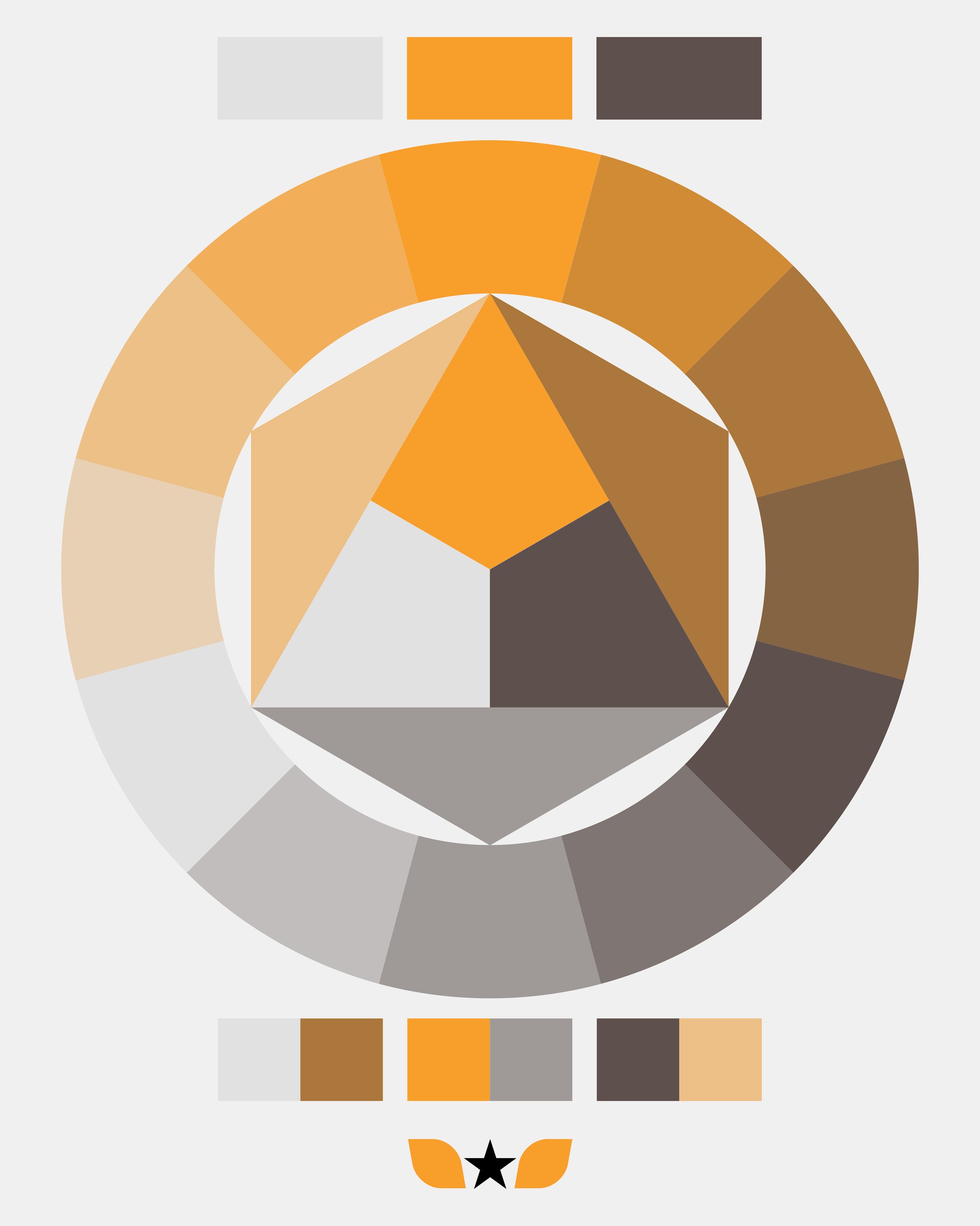
R+D Brandmark
In addition to my commercial work, I also enjoy developing my design and crafting skills under my own R+D brandmark.
This allows me to experiment with different techniques, which I can then apply to my commercial work. My designs often feature geometry and typography on a two or three-dimensional grid structure.
This is a space where I can also explore and combine my personal interests, which include design, architecture, engineering, and science.
The brandmark is built from two stylised wings extending from a star. The wings represent the ability to fly, which symbolises freedom and creativity. The emblem can also be interpreted as a flower, with the two wings as leaves and the star-shaped flower head at the centre. The flower represents growth, beauty, and new beginnings.